
My Role - UX Researcher, Data Analyst, UI Designer and UX WriterDuration - 3 months
Tools Used - Notion, Trello, Figma, Slack, Miro, Figjam
Sweden’s largest conversion optimization team, which helps to use actual data instead of guesswork. Equipped with scientific methods, Conversionista makes customer’s growth potential visible and help them reach their goals.
Overview
Company Logo
As a team, our purpose for this project was to deliver a high-fidelity prototype of the next Conversionista website. Each design decision must be connected to data to back up the reasoning for the design.
Challenge
Client overall goals
- To make visitors stay on site
- Improve job search results
- Keep language consistency
Client business goals
-Recruitment
-Client leads
Target users
- Potential clients - educate, discover
-Existing clients - That already know the CRO part but not the rest
-Potential employee - students, specialist
Research and Analysis

Trello Board - Managing the project and the team
Our first step with the project was to create the Trello board, where we manage the project following the agile methodology. We divided tasks and always updated the task schedule, categorizing the work that is being currently done and the ones that are registered in the backlog.
A survey questionnaire was created and it was targeted at the employees working for the client at various departments within the organization. They were asked about company values, their perspective on the current website, and also regarding suggestions to improve the same. In the survey, our clients have mentioned who their competitors are. So we did the research to see how they are doing, what we like on their website, and what we don’t. After analyzing their websites we have collected our good and bad insights on Miro.

I quickly analyzed other CRO apps to understand what does differentiate Conversionista from its competitors. There is a wide array of apps (the North Alliance, Drift, 56kdigital, Nordic Morning, etc.) that have similar features: full-width webpage for text, bold fonts like Proxima, dm sans, Poppins, witty text on the landing page, etc.
Insights from Survey
When we got the survey back from clients, we analyzed them together. We got a clearer picture of what are the company's/business needs, its strengths and weaknesses, and its website design preferences.
Showcasing their company values
Attracting new talents
Spread knowledge to potential clients
The page should communicate about their work, for whom they work their culture, and the potential valuable people whom they want to recruit
Highlight their type of projects
Clear CTAs, with brand reflection and spirit
Inspirational (especially for people whom they want to reach out to, like recruits and services)
Best-in-class, Specialist, but also provides other services, so highlight other aspects of the company other than CRO
The website should be elegant, quirky as well as informative, and sustainable for years ahead
Make it more engaging
User-friendly navigation
5 Seconds Test (Initial user test)
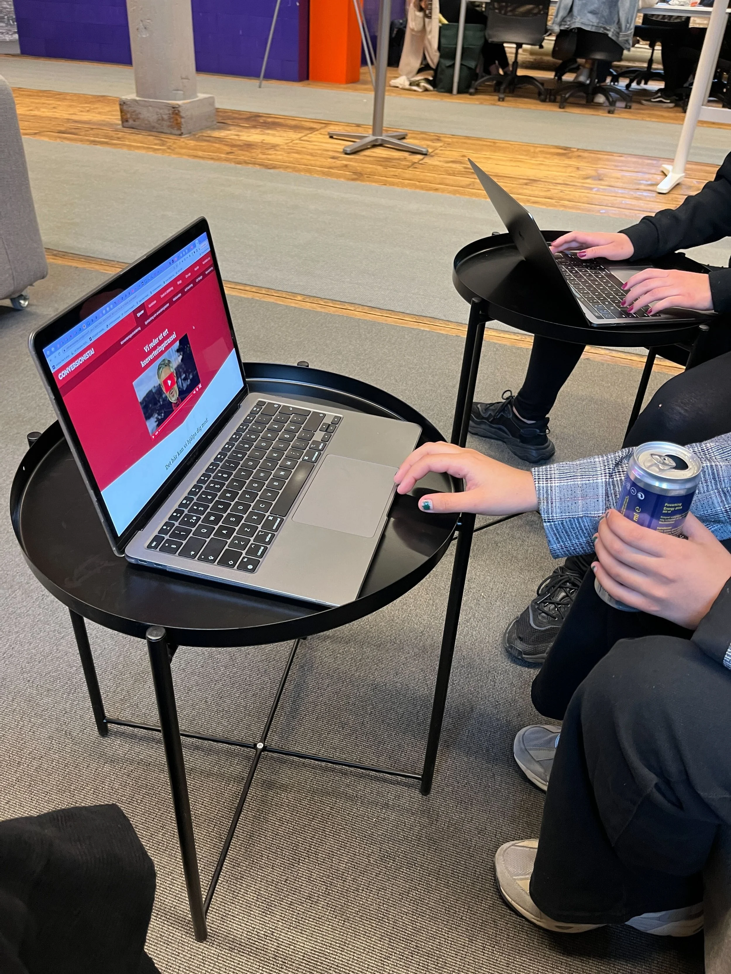
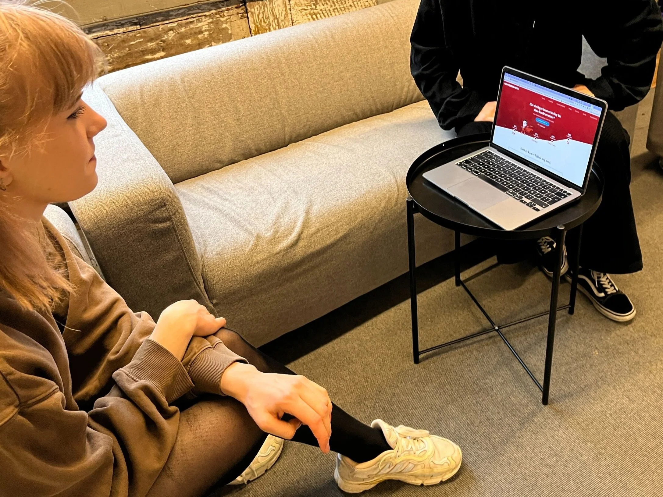
To have a better understanding of how users feel and see the current Conversonista website we did a qualitative user testing, where we got clear answers and points of view that helped us to move forward with our design process. We showed them the landing page for five seconds and asked what they thought it was.
We asked our testers to go from the landing page and apply for a job. The scenario was that they were looking for a junior role, and they have not heard about Conversionista before, what do they do(starting from the landing page)?
During the initial user test, 4 out of 4 people said that the first thing they see is the red colour, and how dominant it is.
As Conversonista being known for its red colour for us as designers it meant that we should not change the colour but we can use it in a different way but still giving the same feeling of Conversionista’s signature.
5 seconds test with the users experiencing the current website
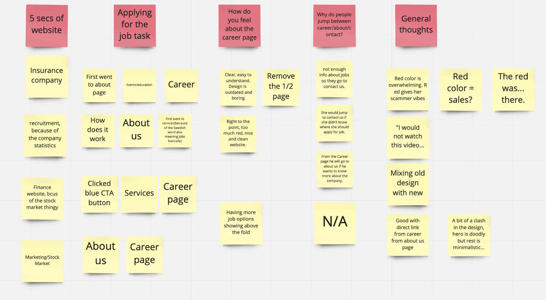
Feedback from the users regarding the current UI of the product
Users were bouncing between Conversionista’s career and about page. User test was the upcoming quest.
We didn’t necessarily get an answer to that specific request when user testing with multiple potential job seekers from our neighbours upstairs. We therefore ran with the assumption that the career page wasn’t informative enough.
But that was not all we found. Users aren’t sure what Conversionista does at a first glance. The first impression was of a finance company. The red also felt overpowering.

Few prominent frustrations of the users
Insights from user test
They have not understood from the landing page what this company is even about, so this must be more clear
UI and context does not show what Conversionista is about.
Lack of information about who Conversionista are
Align on design language
Add something about values etc directly in career page
User Persona

Hypothesis
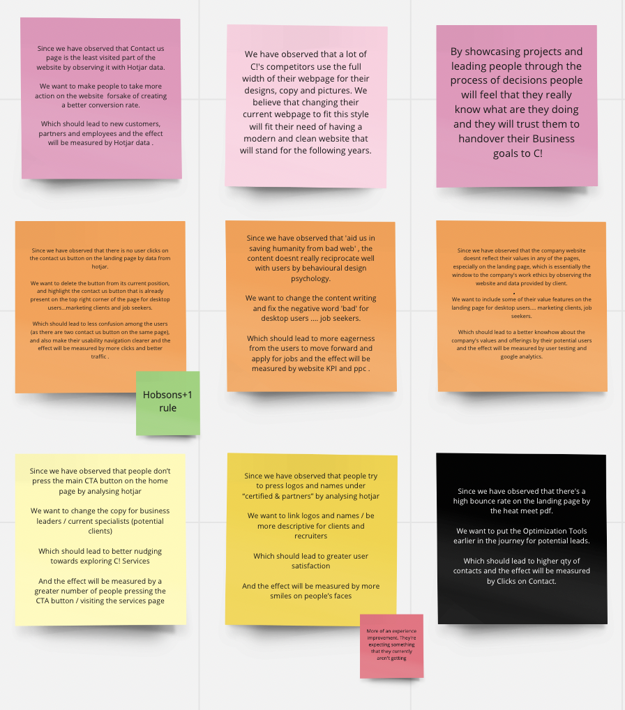
Hypothesis post-its on Miro Board
#1
By designing the career page accordingly to what the target audience was looking for(usability, accessibility, structure, w/e), we will make the website more attractive, which will lead to an increase in the number of applicants
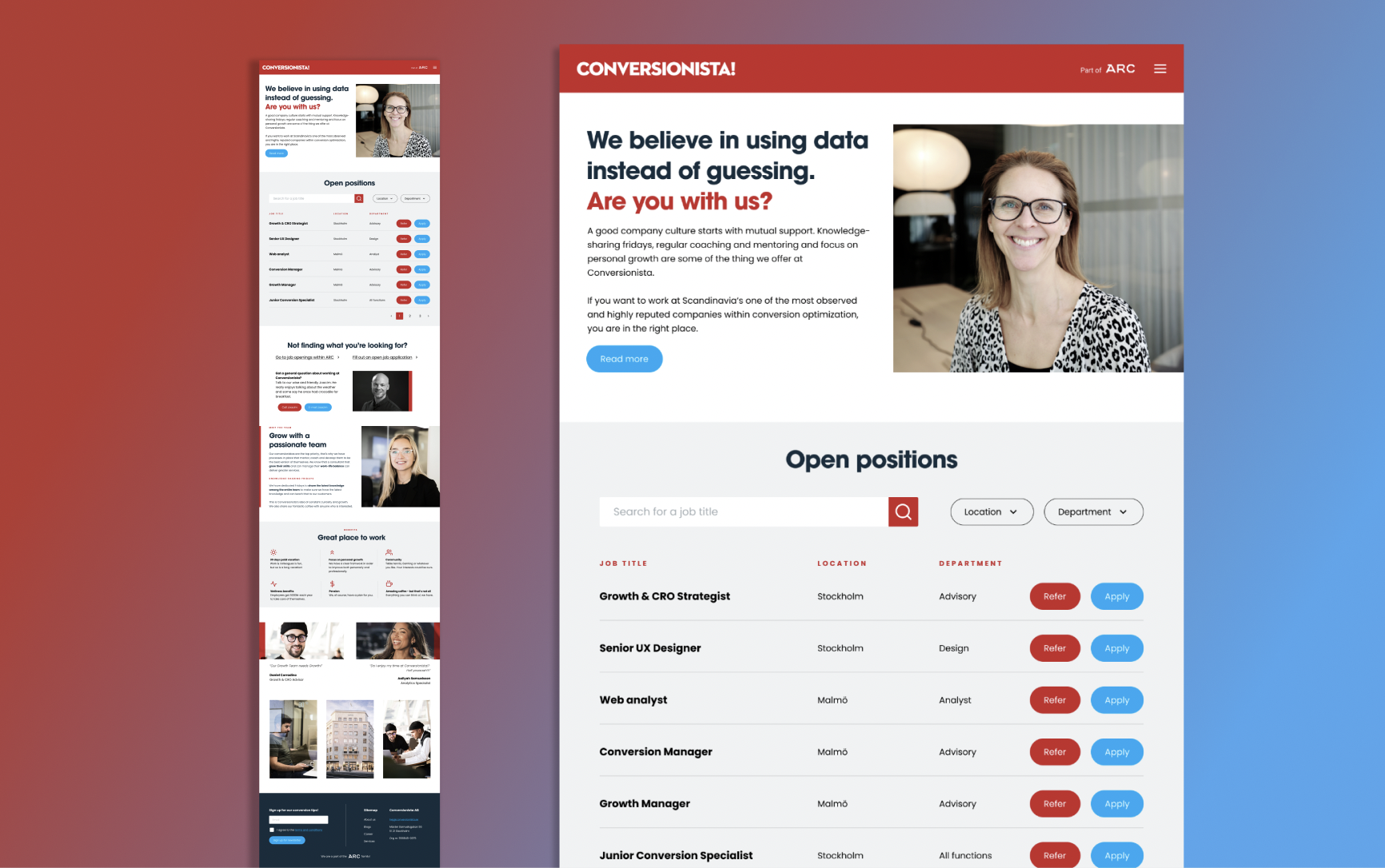
Even if the visitor isn't interested in available jobs, Conversionista should leverage its networks somehow. They may be super valuable!? How might we design a career funnel that motivates visitors to help Conversionista recruit by leveraging their professional networks? "Not the job for you? Refer someone and we'll let them take you out for dinner on successful hire. It's on us!
#2
By using pictures of the employees we make Conversionista seem more human and down to earth, which is one of their goals. Why not include some employee quotes on the career page to make it more human and down-to-earth as well?
Mentioning ARC and making it visible and 'highlighted' will have a positive impact on the company.
Define Tone of Voice
Conversionista, in order of priority, is:
Professional
Human /humble
Educational
Established
Fun / witty
ToV
After a thorough meeting with the client regarding how they perceive themselves and as well as a thorough analysis of the 4 dimensions of the tone of voice, according to Nielsen Norman; the final ToV was identified as Funny, Formal, Respectful, and Enthusiastic.
Creating the Design System


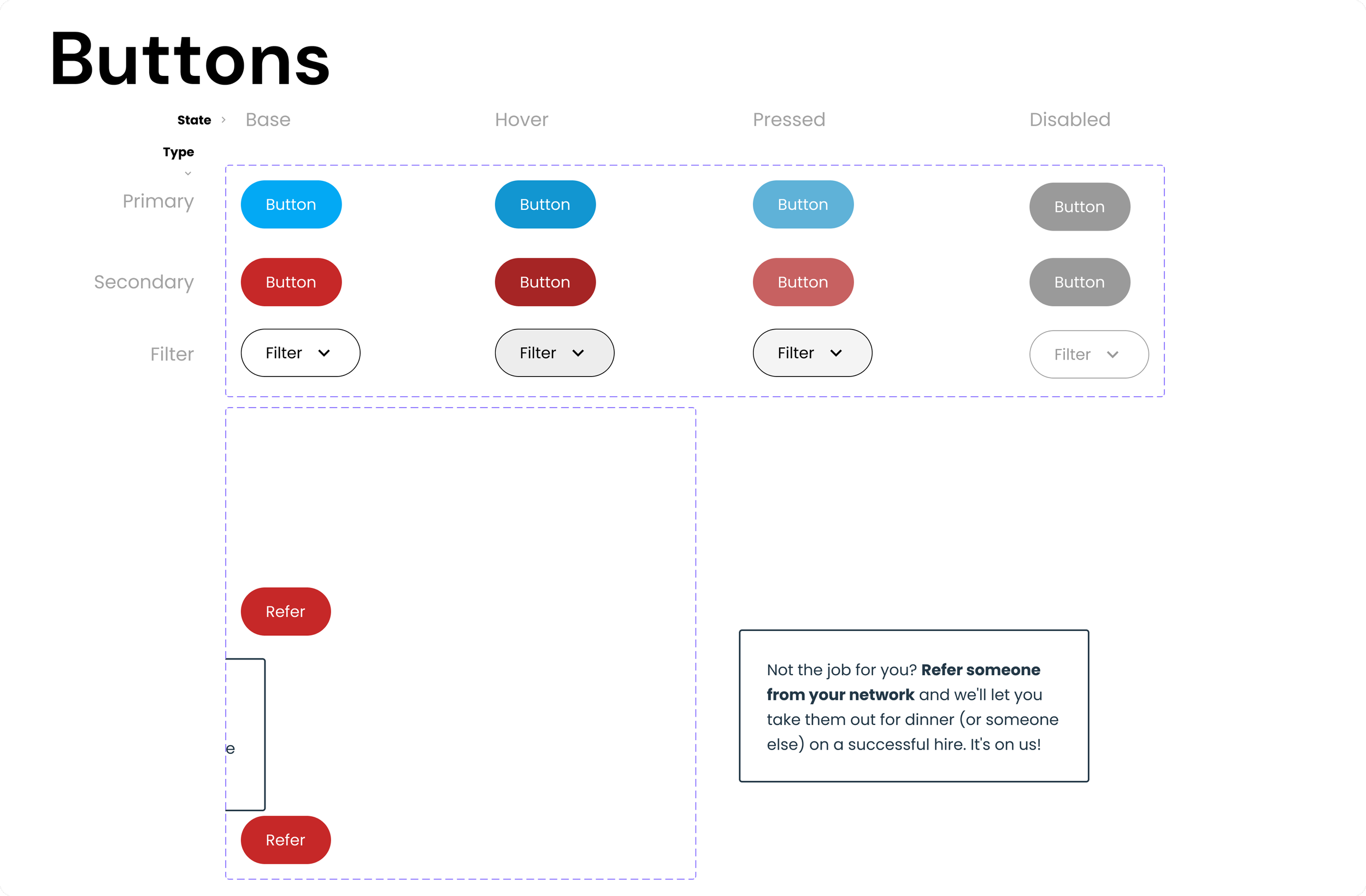


Design Solution
While designing we kept in mind analytics and the ‘WHY’ mindset from the beginning until the end. Everything that we designed was previously analyzed by data that was given to us.
Conversionista wants to be humble. Why not on the career page, where they want people to perceive them as down-to-earth and welcoming? This is why we need to include company culture at the top of the page.
At first, we had a text in the header that sounded quite pretentious: ¨Company culture starts with mutual support. Add knowledge-sharing Fridays. Our conversion heroes are the top priority, that’s why we have processes in place that mentor, coach and develop them to be the best version of themselves¨.
But then we found something in our documentation that spoke more toward the humble side of Conversionista:
They do not care if they overlap with the other brands under ARC, they see it as they’re helping each other grow.
Conversionista hosts knowledge sharing Friday. They also have coaches and mentors, they care about the staff.
This aligns with the career page survey, that people mostly look for company culture and a place to develop their skills further.

User test and Validation
For the user testing, I validated the usability criteria of the prototype on 11 participants. Based on their usage satisfaction I concluded my analysis and also improved my prototype further.
The final prototype was tested with the users. As a team, we were more than happy to realize that our target users were not only satisfied with the product but also stated that they can now really visualize the work culture and values of the organisation and that the job search and application is a smoother procedure after the revamp.
Learnings
This project provided a window for me to learn in-depth about data analytics. the quantitative methodology was explored more and data credibility increased.
I learned quantitative dat tools like Hotjar, Google Analytics, Fullstory, Amplitude and Logrocket.
I got an analytical overview regarding conversions and optimisation, the process of conversions and the intricacies of analysing user behaviour in regards to session visits according to analytics tools.